Blog
Return to Blog »
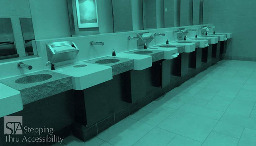
Janis Kent, Architect, FAIA, CASp © September, 2025 As we age, there are a whole myriad of items that happen to us and our bodies that we will need to accommodate for. Some of it sneaks up on us slowly, and some of it just feels like we are getting more uncoordinated. But a lot of these can be dealt with by designing within certain parameters that may not be how we typically think or design. We know that for people who have low-vision, we want to have a contrast of light to dark particularly in signage. As we get into our 70’s almost half of the population starts having difficulty in differentiating color in the blue and yellow spectrum. Being able to easily differentiate purples from blues, and greens from yellow becomes more difficult. This increases to about ⅔ of the population in their 90’s. What this means is, that if you use those color palettes and need to differentiate items, also plan on contrasting items using tints from light to dark. So perhaps a light blue with a dark purple, otherwise if the design needs contrast you loose the interest, and basically it all blends and becomes monochromatic. There does not seem to be the same loss with greens or reds. Another item that happens is we many times loose our depth perception. (Isn’t growing older such fun?) People do not perceive the edge of the counter if it does not contrast with the floor below or the vertical surface.They may think they are putting their drink on the counter whereas they miss it, and instead it lands on the floor. Particularly if you are in a hurry. So contrasting horizontal surfaces to vertical surfaces such as in kitchen cabinetry. Or contrasting the counter with the floor. This contrast can be in color and/or texture. And at the same time, contrast the sink or lavatory color with the adjacent counter for the same reasons. It is also better to contrast the floor with the walls so the edge can be easily perceived. Again, a light to dark contrast, or a texture contrast can help. One thing you would want to avoid is having mirrors go down to the floor. With lack of depth perception it might appear you are walking into another room and you would be walking into the mirrored wall. Or if you have stairs, contrast the outer edge of the tread with the rest of the tread and stair riser. Another item, as designers, we often-times try to blend the color of the door with adjacent walls which makes it more difficult to find the door. Or selecting electrical receptacle outlets and switch plates blending with the wall since these plates are not something we generally want to have pop-out at us. But again, as we age, if it is blended, these items may be difficult to find. In our own home it may not be so much an issue, but for others visiting us, we may want to reconsider and contrast these elements. Door hardware and cabinetry pulls are better if they contrast with the vertical surface. This is also true for faucet and toilet controls and built-in accessories. If possible, try and avoid polished or satin chrome which can reflect adjacent items making it more difficult to see. Furniture colors should contrast with the floor so it is easier to perceive the element. Clear glass tabletops can also be problematic since they can be reflective and you may not see the edge of the table or even the table itself. Using darker colored translucent window covering helps to mitigate glare and brightness. Monochromatic or pastel color themes are more difficult to navigate. So a contrast of dark to light or tone and shade helps with the aging eye. And even if this is not for us personally, we may have others who are older who visit us that these suggestions can help them better function when visiting. Keep in mind that the more comfortable we are with our environment the more independent we feel…which is a good thing particularly as we age. Be aware that your local City or County may have additional requirements that are more restrictive than the State or Federal requirements. Also, this article is an interpretation and opinion of the writer. It is meant as a summary – current original regulations should always be reviewed when making any decisions. © Janis Kent, Architect, FAIA, CASp September, 2025 .Color Considerations and Aging